Friday, 9 September 2011

Street Art - FOOTSCRAY


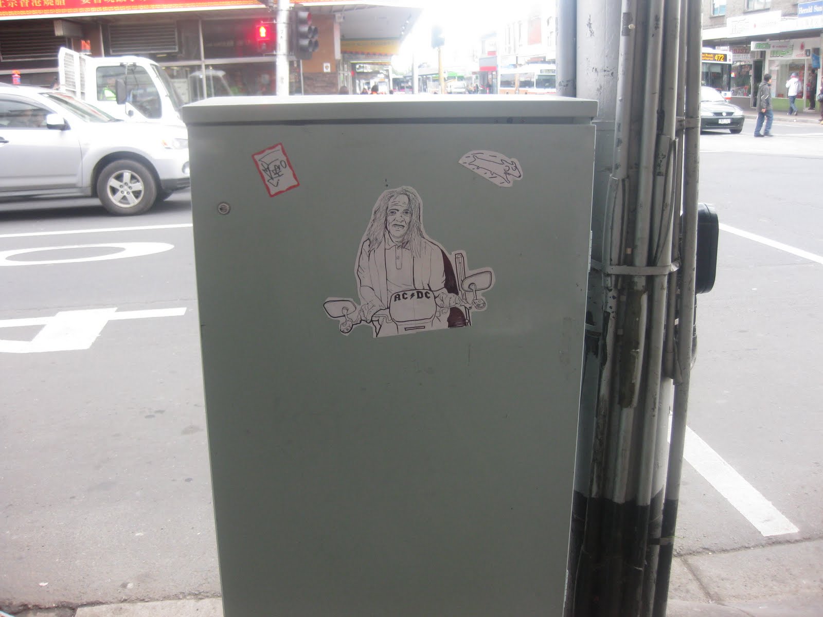
In the past month, l haven’t had the chance to do my regular gallery hops. I have however, discovered the slow evolution of street art in my own neighbourhood. There has always been great graffiti along the Western Suburban train lines. In the past few months, the streets of Footscray are slowly transforming with stencils, paste-ups and sprays. It’s refreshing to see although the street cleaners remove it quickly. Unless you’re like Baby Gorilla who chooses elevated positions for her work. It does depend where you go and seems the main streets are unpopular with street cleaners. Like Lego man who has chosen quite an obvious wall that crosses the main street and seems untouched…thankfully.

The most recent contribution to the street art scene is these stickers l have noticed on electricity boxes. They are A5 size and have actually been hand drawn with black felt pens. The subject is the most fascinating, as they are portraits of local people you see around the streets. That being the woman who lies under the ATM machine asking for money. There is also the old guy who hangs outside the Hong Kong BBQ restaurant asking for cigarettes. Or the AC/DC dude on his electric scooter. These stickers are simply portraits of the characters around Footscray. It looks to be the same artist who also uses the stickers against existing graffiti, which is quite clever.

So if you’re ever in the area, just look a little bit closer at the streetscape particularly near the Footscray Market. You will no doubt bump into a character.    

You can see more on the below link.

Wednesday, 10 August 2011

Chantal WYNTER and Craig COLE - 57 Irving Street

This is the second instalment of my project at 57 Irving Street which is in collaboration with Craig Cole, also a local Footscray artist.

I have continued to use text in each of the four windows. Every individual poster has common statements used by the various characters throughout Footscray.

We are all familiar with the recognizable faces in Footscray such as Nick, the Olympic Doughnut man, Kevin at the coffee shop, Franco Cozzo, the gang at Footscray’s Best and so on. We are exploring the infamous characters that can be seen and heard daily around Footscray. We have approached this through a comic book theme, which embodies these daily remarks and observations.

These posters are designed to encourage the passer by question the greater community known as Footscray.  

Monday, 8 August 2011

Anne KUCERA – “Alone I Keep the Wolves at Bay”

Walking into Trocadero Art Space in Gallery 1, I’m drawn towards a corner with black and white checkers beginning at the floor and working up towards the ceiling. They are half completed and gives you the feeling that you could either disappear towards the ceiling or floor.  A small white chest of draws sits there and on top of that sits a hard covered book. Don’t be fooled by the picturesque scene for here begins the nightmares.

An Abstract Nightmare is the name of this first piece. Open the book and a paper pop up scene of a woman appears and she is either drowning or being sucked into the whirlpool of checker squares. The size of this piece is a little larger than A3. The way the chequered pieces are crafted gives you the feeling of movement and a spiralling effect to an underworld that lives under the checkers.

The largest of the pop up books is named The Clearing (seen in image above). Open the book and your presented with a forest of trees and in the clearing sits a wolf facing a seated person on their knees. A standoff or as the title of the show suggests, alone l keep the wolves at bay. Each leaf of each tree has been individually cut and placed on each trunk. The stare between the wolf and person is intense that you forget this is paper. The structure of the pop up book is clever and for some of us, takes awhile to figure out its construction.

The artist Kucera is sitting the gallery as she is also the treasurer of this artist run space. She tells me that these artworks are small pixels of her nightmares and dreams. Being slightly insomniac, she has built these scenes from her mind and dreams. Kucera has been working on this show for eight months. She taught herself how to build these paper wonderlands. 

For me, pop up books reminds us all of our childhood and the surprise of what each page will present. In this exhibition, as you approach each book your excitement builds. You read the title of the book in the anticipation of the image that you will be greeted with. The exception here is that you’re not a child but an adult with fears, apprehensions and failures. These adult pop up books capture these emotions in a strangely fairytale way.

Kucera has exceptional attention to detail and has beautifully mastered these pop up books which makes for a successful and compelling exhibition.

On until 13th August. 


Kristin McIVER – “Statement Pieces”

I admit that l am bit of a text fanatic. Barbara Kruger and Jenny Holzer comes to mind. My mother has questioned how text based artwork is considered “art” and not a piece of literature in a book where its tradition is based. I believe it’s the way you present the text, which distinguishes art from literature. Like any form of material used, nothing is sacred when it comes to artwork, especially in this conceptual climate. 

I first saw McIver’s work in a group show so l was looking forward to viewing her solo exhibition at James Makin Gallery. The title of the show best describes this group of neon lit words. Interestingly, the mostly single words have different titles which add an extra element to the works. You have to take a step back when viewing these and view them individually. We are bombarded daily with neon signs and you can easily switch on your “tune out” button.

McIver has transformed a word to make us not only think of the meaning but to put it into a context by visually adding small elements. An example of this is “Wishlist”. The word “wish” has been repeated three times in a vertical line. Simple and uncomplicated.  There is also the piece “Changes”. The word “change” is written in a neon white light and flashes on and off.

I also enjoyed two pieces that use not only the neon signage but external materials to enhance meaning. The first being “A Questionable Choice” which was a neon sign in a box with the letters half made. The reflection of the sign on the floor completes the word. The other favourite was “The Good Life II” which was the word “good life” written in neon white with plastic black chains falling from the ceiling over the text.

I feel these works questions our consumer mentality and notions of desirability in a developed country such as Australia. Each piece are all concepts that as humans we relate to whether we encompass it or not. These pieces have a culturally and classless motif, that is people in the same economic and social background would find a connection to these artworks. Go and see.

Until 27th of August

Tuesday, 26 July 2011

Kate JAMES – “The other side of despair”


This new space; Daine Singer, was the last gallery on my Flinders Lane visit. I had been looking forward to seeing this space. It was our luck that the heavens had opened and rain was pouring down. The city lunch rush hour was on with people scattering for shelter and frantically checking their mobiles as plans change. We nearly ran past the building in hast to get cover.

Down the stairs to the basement in typical white gallery fashion, is Daine Singer space. You would hardly know of the chaos outside, only a few distant voices and hushed murmurs. The gallery is in an L shape.

I was instantly fascinated by the first installation named Transference. There stood an installation of a glass funnel that was attached at one end. There was an enclosed woven horsehair basket and the other end was the funnel where pieces of coal sat. To me it was a morphed funnel that transferred one substance to end in another substance but the essence remains the same. The woven object of course horsehair could have been a metaphor for a deep emotion, that being despair. The end result may have been the emotion broken down with remanence of the same heaviness that being the coal.

Further along was James installation named Hourglass. This was on the wall where a metal funnel hung with a long metal tube. The funnel and tube looked hand made and raw in construction. The top end of the funnel had a small mound of red pigment. The end had an attached red woven basket of horsehair. It was in the shape of a large half deflated balloon that faced towards the ground. I wanted to wait to see the red pigment fall and go to its end as an hourglass would. Time stood still and the creel seemed to inflate with hours accumulated.

The other installations where just as thought provoking and physically fascinating. There was also three framed pieces. I suggest visiting the show.

I really enjoyed the work by Kate James. My particular interest was the diverse use of materials that worked well depicting for me various states of emotion. Her skill in weaving the horsehair is exceptional. The hours spent must have put her into an almost mediative trance. An aspect of making artwork to be explored.

On until 30 July.

www.dainesinger.com

Thursday, 7 July 2011

Dulce PINZÓN – “The Real Stories of the Superheros”


I came across this gallery, the Australian Centre for Photography in Paddington, Sydney by accident.

We where fortunate to view the photographs of Mexican artist, Dulce Pinzón showing in Gallery 3.  She had photographed mainly Mexican migrant workers in New York. Each photograph depicted the person in their place of work dressed as a superhero. The caption described their superhero title, their actual name, place of origin, employment and the amount of money they send home to their families every month.

The superhero in each photograph has an expressionless face as though they are unaware of the camera. Other people starred straight into the camera unsmiling. The type of work each person was involved in varied from taxi driver, union organiser, waiter, courier to demolition worker. The superhero outfit seemed to relate to the employment. The suits where worn as clothing, as though hired or bought from a cheap $5 shop. There wasn’t the sleekness we associate superheros to. The faces painted matching the outfits. This added to the appeal and I’m sure was intentional.

These working women and men, as the title suggests, are superheros. All working hard in physically demanding employment to pay not only for their own necessities but to send money home to their families. They could be forgotten as they serve food to your table, deliver a parcel or work at the Laundromat washing clothes. These series of work does relate specifically to migrants working in North America. These themes could be conveyed to a developed country such as Australia.
 
On view until 10th of July.

Wednesday, 6 July 2011

Mark BOOTH – “11XU-PVC.9323745.006474”

I always enjoy visiting First Draft Gallery whenever I’m in Sydney. It’s a gallery that always has quite an eclectic group of work. I find l get captivated by the artists’ work that is showing. It can be from fascination to distaste but either way l am challenged.

The work of Sydney artist Mark Booth in Gallery 4 was appealing. He had cleverly constructed PVC piping twisted and turning onto each other. Each piece was about 1 meter by a metre painted white but it’s joins still visible. The pieces where hanging from the wall at eye level. They where each unique in their twists and turns. You could mistaking think that each piece had a use and where intentionally there to disperse a waste. They where each part of the wall space serving a purpose. It seemed the pipes had gone askew and where feeding onto each other rather than taking waste away.  I can’t help but relate PVC piping to waste.

To see these everyday objects constructed in a quite a beautiful way in a gallery environment makes me want one of these. If they had been painted black or a bold colour, the allure would have been muted.

These wall constructs had an effortless charm about them while contradictory they would have been difficult to assemble.

Take a look until 17July.